More than 1.5 billion covid-19 vaccine doses have been administered in over 180 countries. That works out to roughly 21 doses for every 100 people. However, as you can see from the animated chart below, the pace—and coverage—of vaccination programs has been highly uneven.
If you hit play on the chart, produced by Our World in Data, you can see how the vaccination programs have evolved over time from December 20, when the first early patients were receiving shots in a handful of countries, to now. We’ve started out with the G20 group of countries, but you can also customize your view to track progress in specific countries and even see how different nations stack up against one another.
Countries that have racked up over 80 doses per 100 people include the US, the UK, Bahrain, Chile, Israel, and the United Arab Emirates. As the chart runs, you can see how the US, which was lagging, starts to catch up with the UK, which has had an extremely successful vaccination rollout. Some of the world’s smallest territories have recorded impressive coverage too. Gibraltar, Seychelles, San Marino, Bermuda, and the Cayman Islands have all reported more than 100 doses for every 100 people (this is possible because some vaccines require two doses per person).
Israel’s spectacular rollout is also starkly impressive when played alongside the performance of the European Union, which had a slow start. Israel was one of the first countries to demonstrate the amazing effect of mass vaccinations on covid-19 cases, with infection rates plummeting after over 90% of the over-60s received their first shots. That pattern is replicated in every country that has vaccinated significant proportions of the population. Case numbers in the US are rapidly dropping now that more than 60% of adults have received at least one vaccine dose.
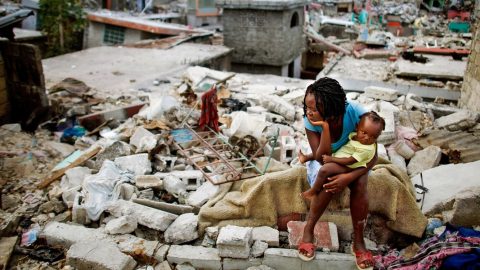
Meanwhile, large swaths of the world are yet to record a single vaccination. Haiti, North Korea, and a number of African countries have not vaccinated any citizens yet. Notably, Brazil and India, the two worst-hit countries currently, have significant chunks of their population still unvaccinated (Brazil has given out 26 doses per 100 people and India has given out 14).
Our World in Data is a collaboration between Oxford University and the Global Change Data Lab, an educational charity. Its website hosts a vast number of interactive charts and visualizations about the pandemic, encompassing everything from daily case numbers in each country to vaccinations to testing rates. Explore for yourself.

Recent Comments